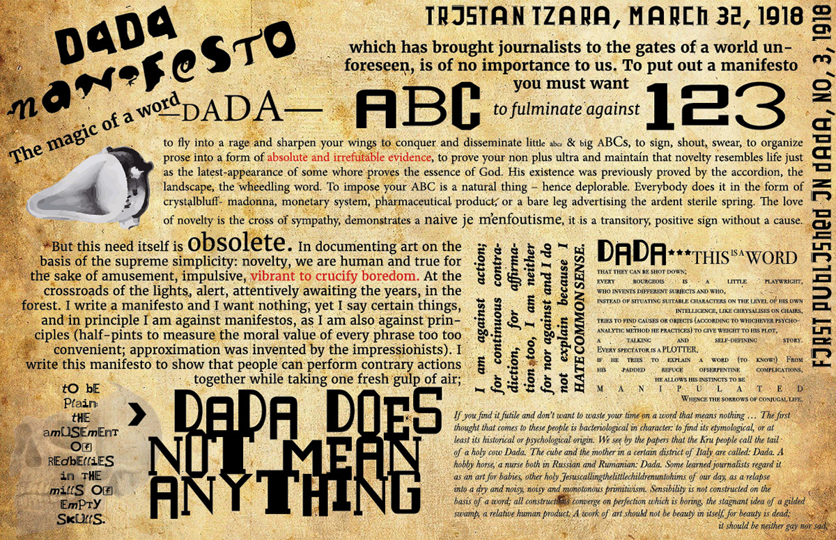
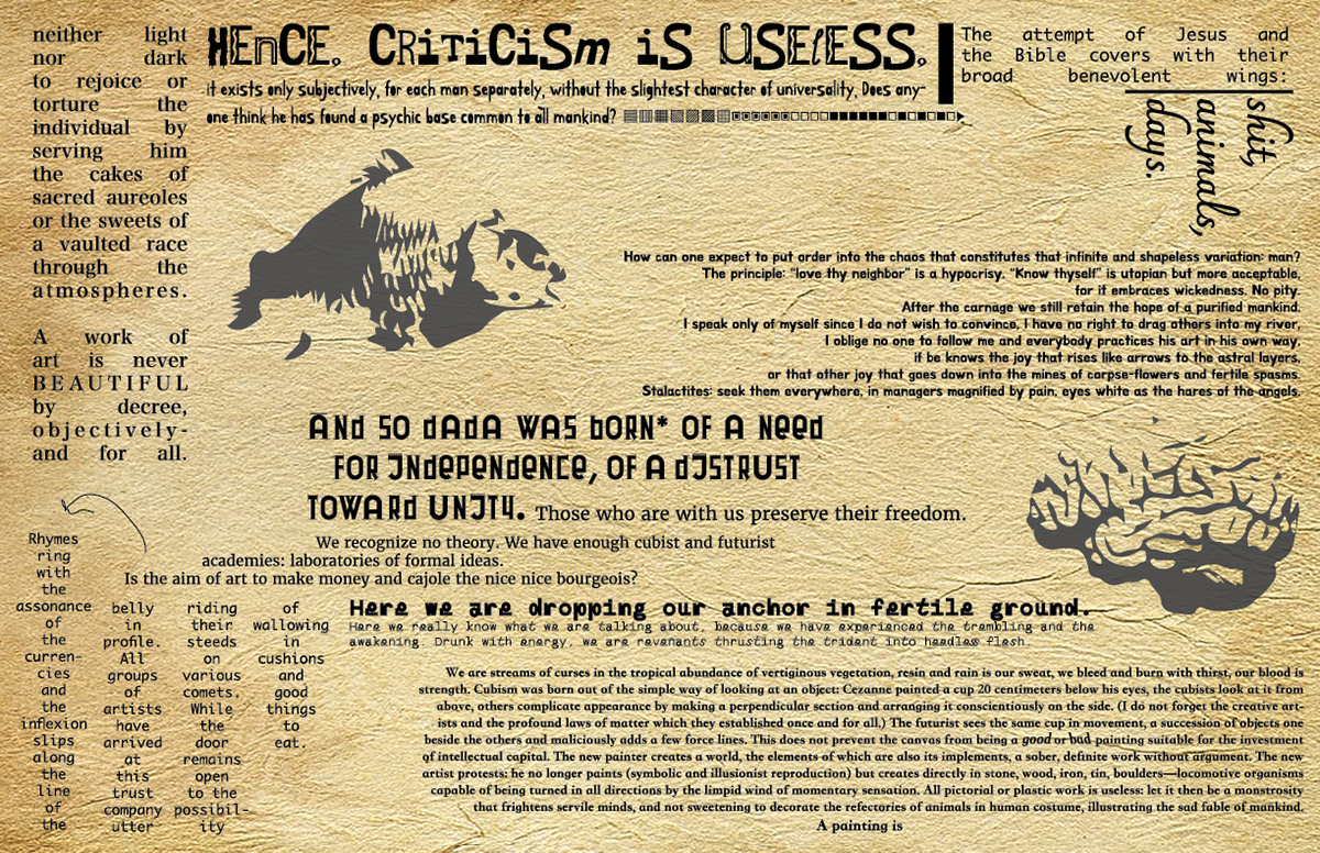
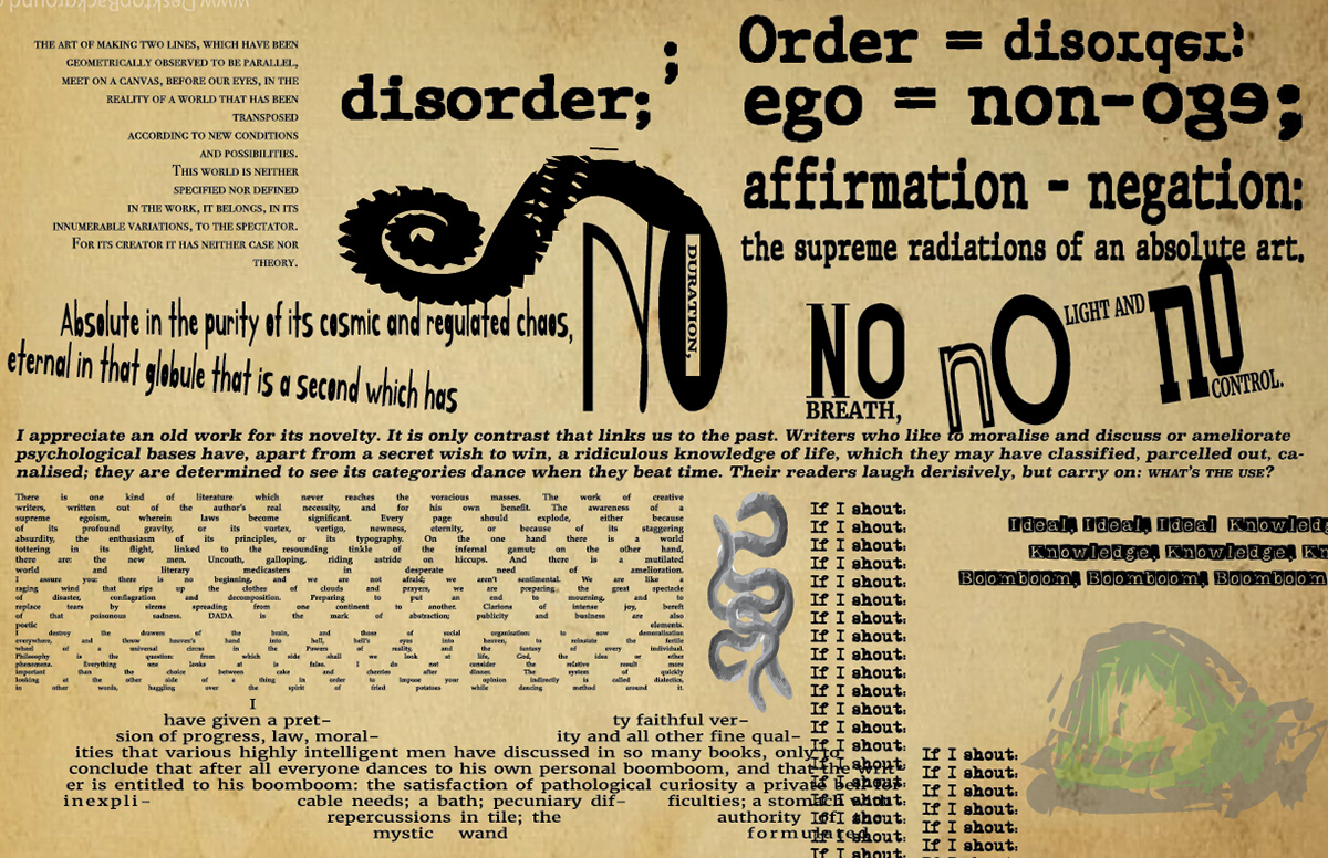
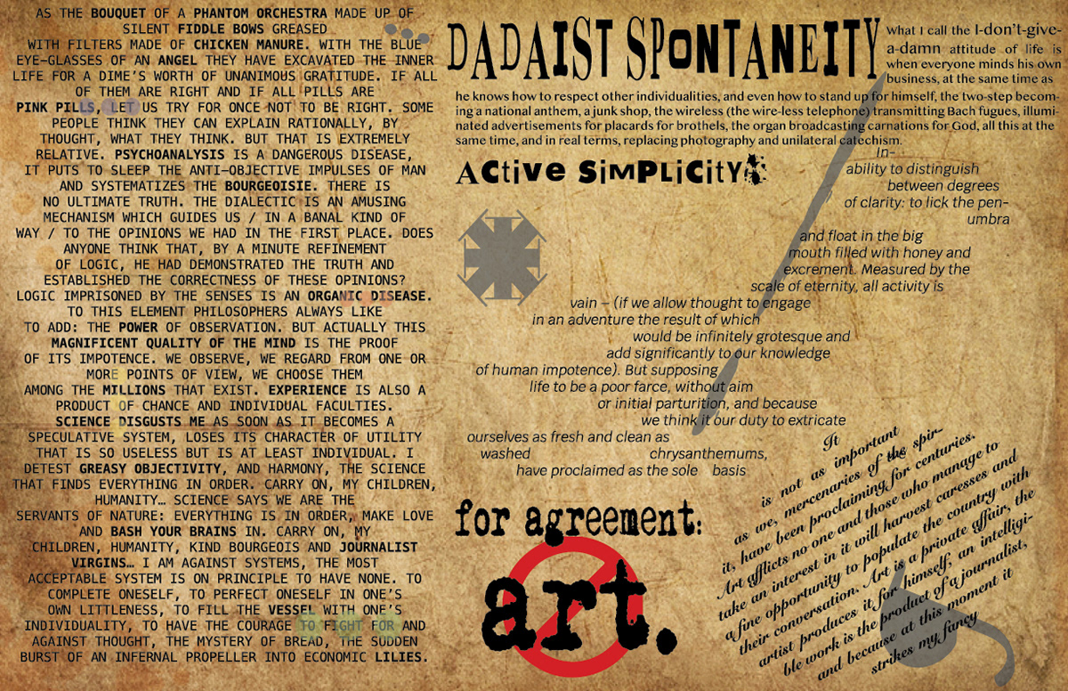
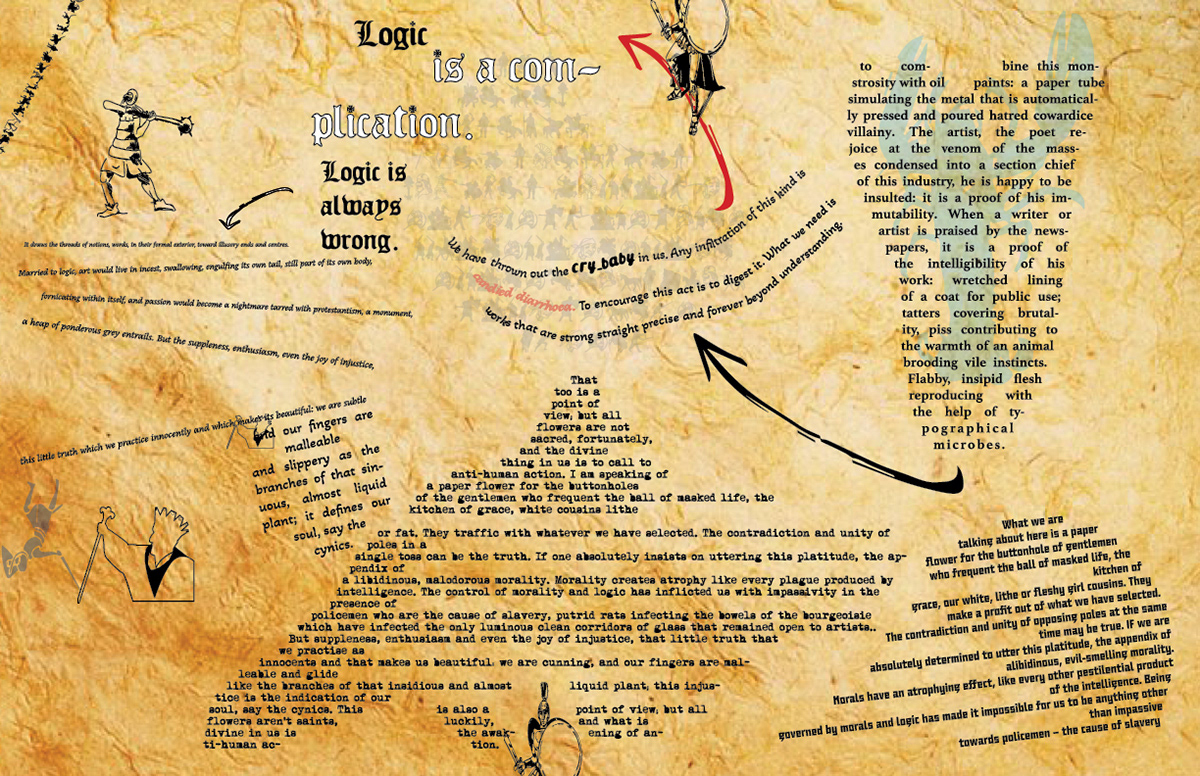
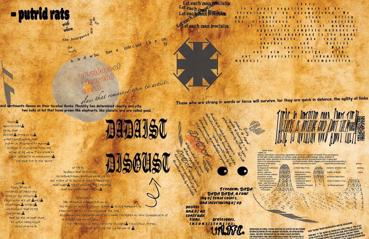
The basic setup for my work on this project was to create six pages displaying the Dada Manifesto. I would attach those pages together in some physical way, and then I would mix them with pages from two other students who were doing the same thing, inspired by the Exquisite Corpse game. So, we divided the manifesto into six sections and began working independently, hoping to create vastly different layouts.
Jumping into this project, I split each section up even more, picking out words/phrases that I wanted to emphasize. I created several blocks of text that I’d paste into Indesign before changing them up through a variety of fonts, sizes, sometimes colors, and arrangements. Through our group critique, I was conscious of how many aspects of the pages were too “squared off”, which led me to the idea of having the six pages become increasingly less structured and more hectic. This was also shown in the page textures becoming dirtier, as well as becoming more wrinkled and torn in my physical hand-in. The last two pages were the most enjoyable to create because I let myself get a lot more weird and loose with the structure. I also incorporated typefaces that were a bit harder to read, something I tried to consciously avoid up until this point.
I also sprinkled in elements of photography, mainly imagery pertaining to words in the manifesto or related to certain art works. For example, the outline of a lobster came from the Lobster Phone artwork by Salvador Dali. I used silhouettes and glyphs of certain typefaces that I manipulated and stretched around.
