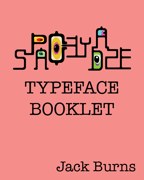
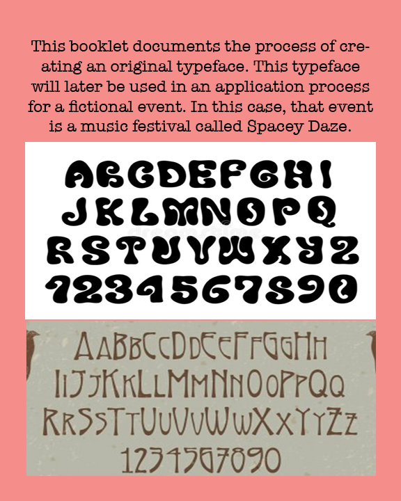
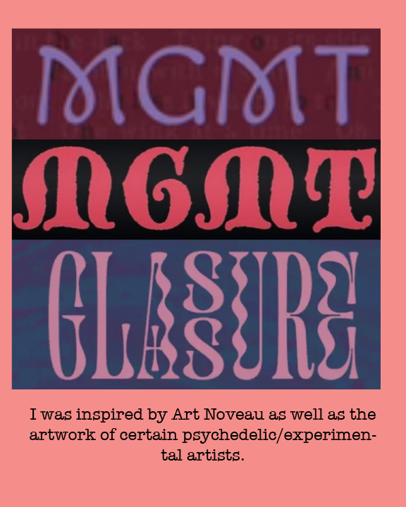
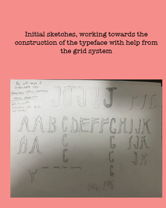
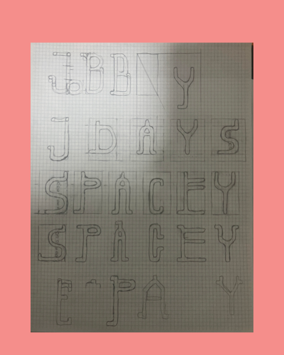
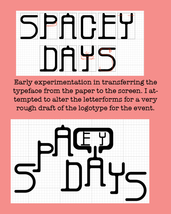
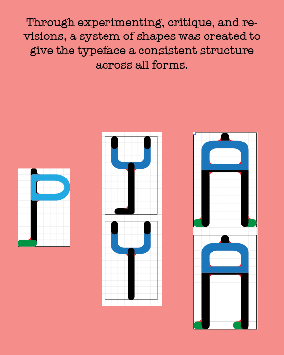
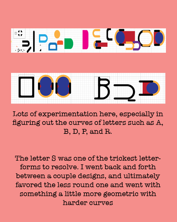
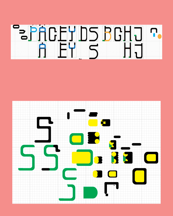
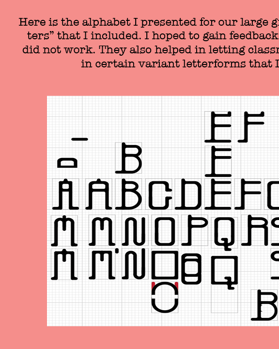
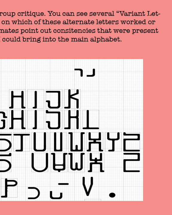
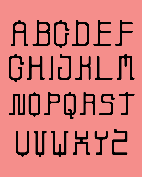
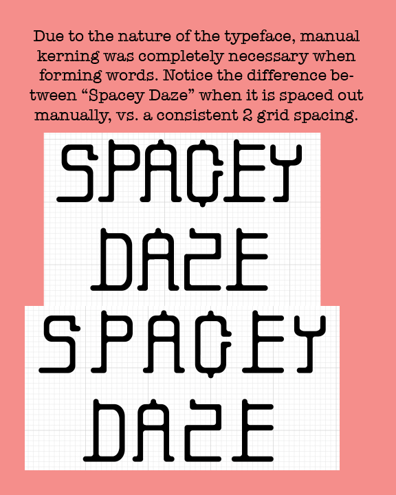
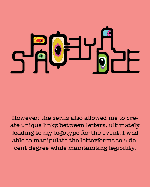




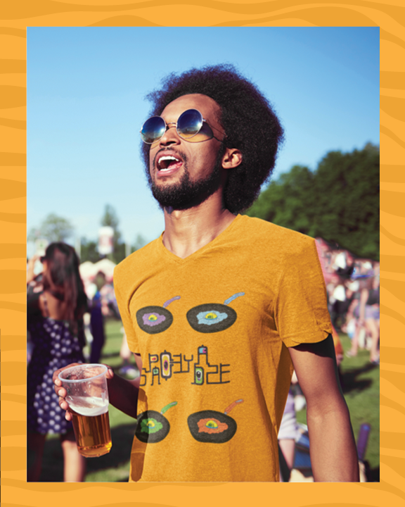
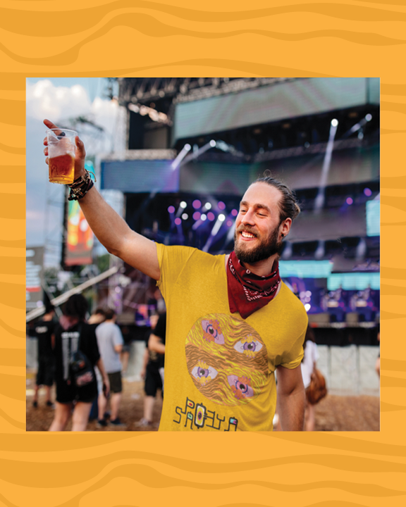
This project was certainly one of the largest ones I’ve worked on at Drake. We began with typeface construction, something I’m familiar with from a project in Fall 2021. The typeface I created then was very blocky, and for this one, I wanted to move towards something smoother. I still ended up maintaining the geometric nature of each letterform, as the grid was a big element in the development of this typeface. The thing that was very new to me was creating very specific shapes to aid in the construction and consistency across the letterforms. I feel that my letterforms weren’t too complicated so that this became an issue, or too time consuming. Still, they were necessary in allowing the forms to work as they do.
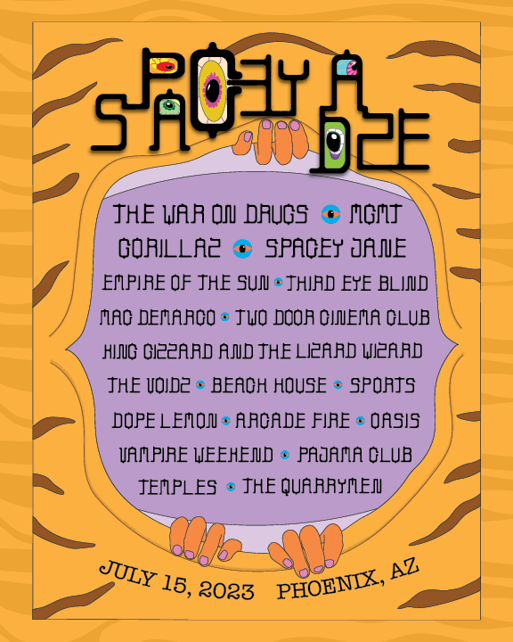
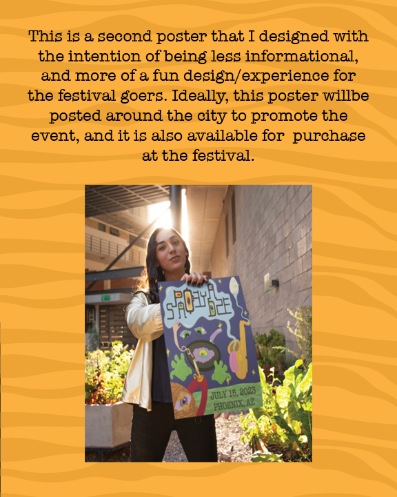
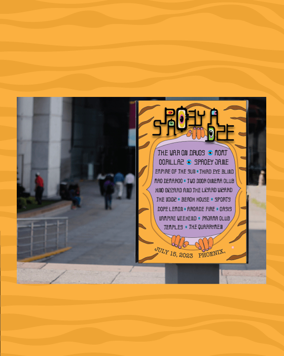
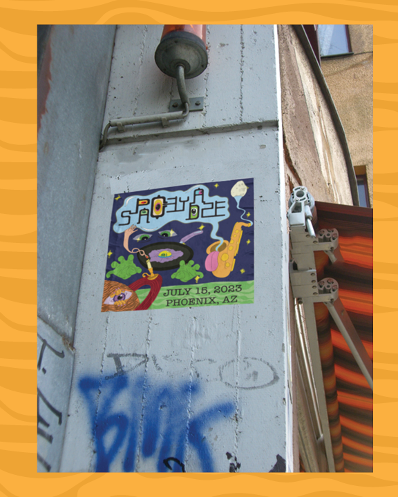
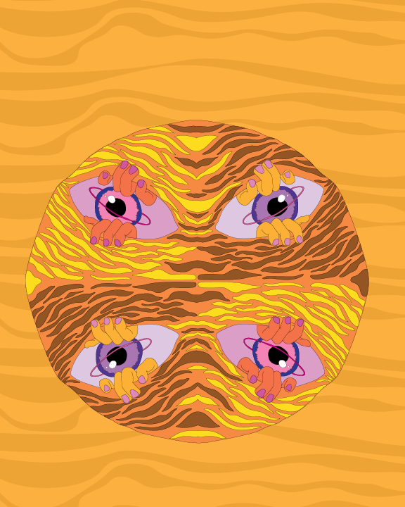
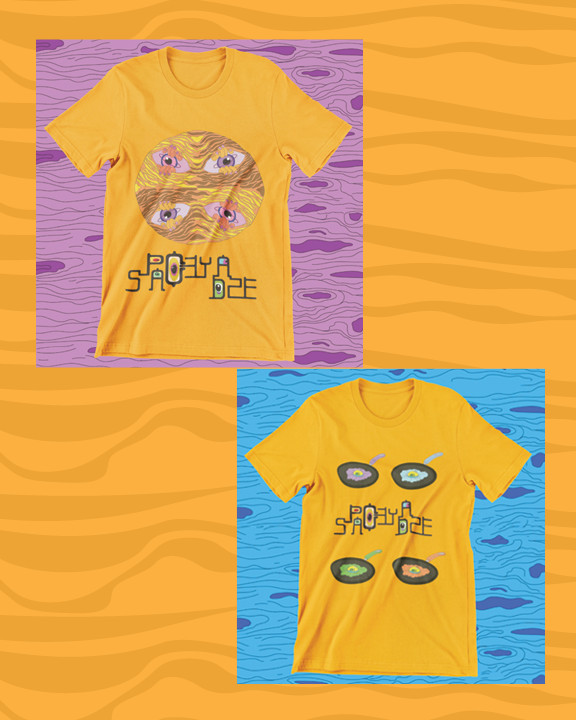
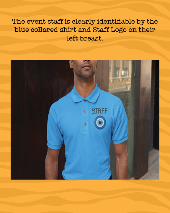
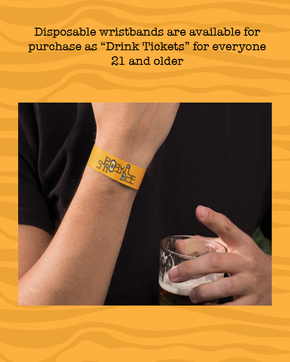
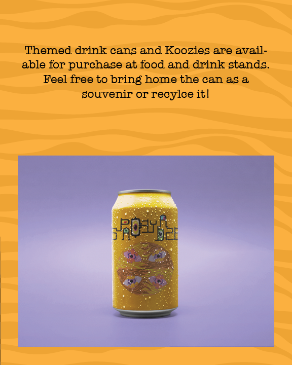
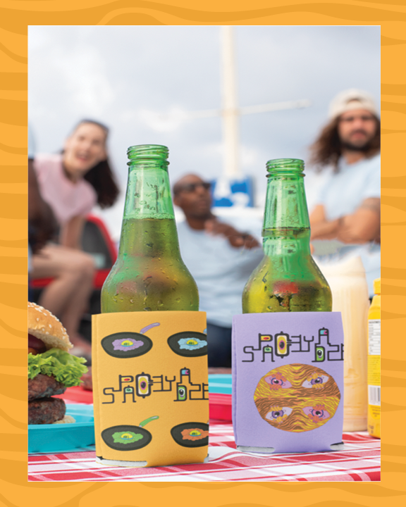
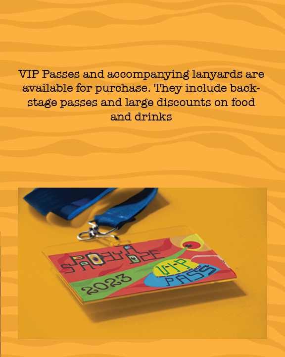
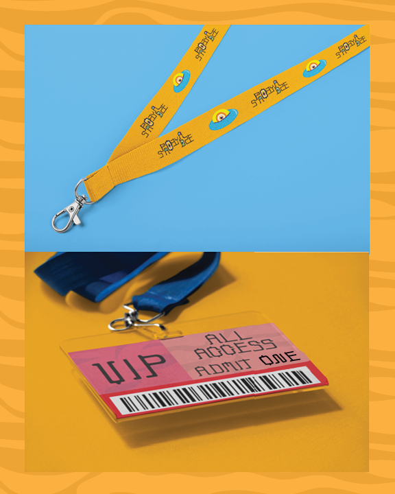
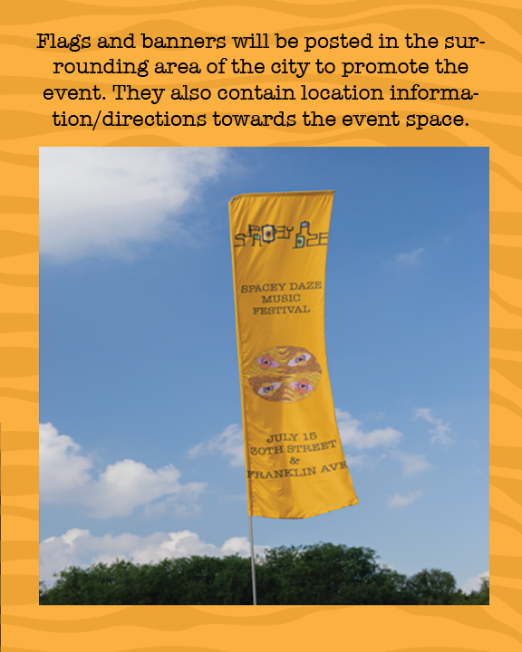
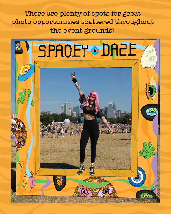
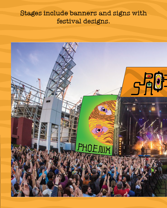
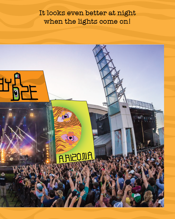
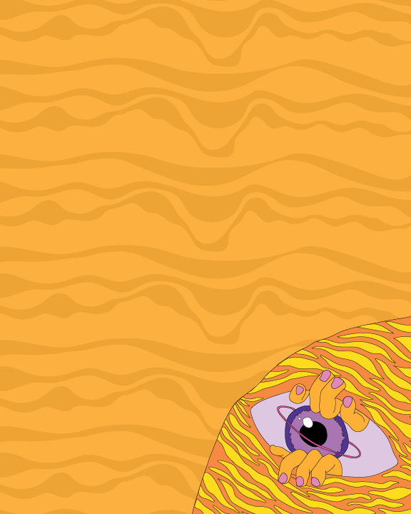
I turned out to be very satisfied with the way the final typeface came out, especially once I started putting them together. This really brings us into part 2 of the project, the application process. The biggest use of my typeface was for the music festival lineup poster. Part of why I think the typeface really succeeds here is because many of the artists included are highly experimental or psychedelic, or just straight up weird. For the core crowd that this festival is trying to attract, I think it works. I also think the design elements that accompany the typeface across the mockups also succeeds in creating this unique vibe that the festival is there for. If I could pick one element to describe it, I would choose the “Photo Op Structure”. It includes the typeface and almost all of the designs that can be seen on the posters and other signs. This aspect of the project was my favorite, simply because you get to make all the rules. You decide who plays at the festival, the shirts people can buy, the look of the stage banners, etc. Producing more and more applications and seeing the “look” come together was something really satisfying to me.
