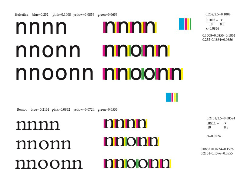
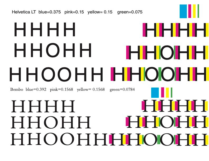
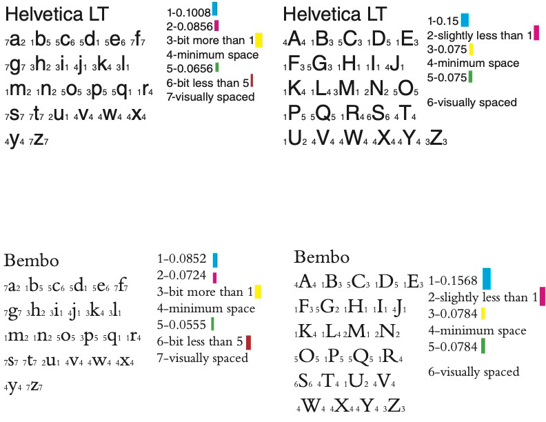
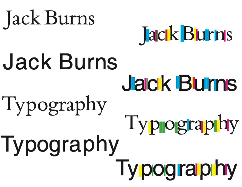
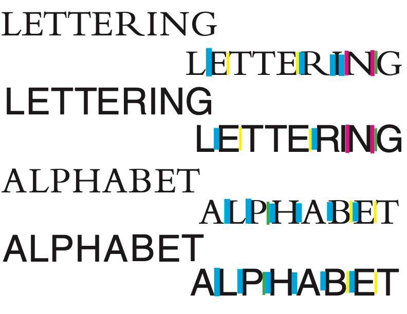
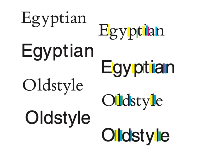
This project showed me that the presentation of letters and words is a lot more complicated than I realized. I had no idea that there are different considerations to be made for each individual combination of letters that will appear next to each other. Personally I found the letterform “t” to be tricky, particularly in the Bembo font. Since the left side of the cross stroke is shorter than the right, it could be difficult to find a spacing that looked natural on both sides of the letterform. Spacing the san serif typefaces was generally easier for me because kerning letterforms with stems such as “E”, “L”, or “N” was much simpler than the serif letterforms. However, I did have more fun spacing the lowercase serif typefaces due to the variety in lines. The word “Oldstyle” was the most visually appealing to me. Overall I thought Tracy’s technique was helpful, but most of the time I ended up kerning the letters closer together once I removed the colored blocks. There were always at least a couple letterforms too far apart, so I tried to adjust them based on the letterforms that seemed to be in perfect positioning after the Tracy spacing method. For me, the start of the project was mainly focused on following the mathematical formula laid out for me. When the project required us to use this system to apply measurements for each letterform in the alphabet, it incorporated the first bit of artistic liberty in asking us to determine measurements that were “a bit more” or “slightly less than” the lengths we had calculated. It also forced us to determine the entire spacing of certain letterforms on our own. Once I got towards the end of the project, I started really trying to use my instincts to space the letters, after using the spacing method. I hope that coming away from this project, my eye for spacing is a little more keen.
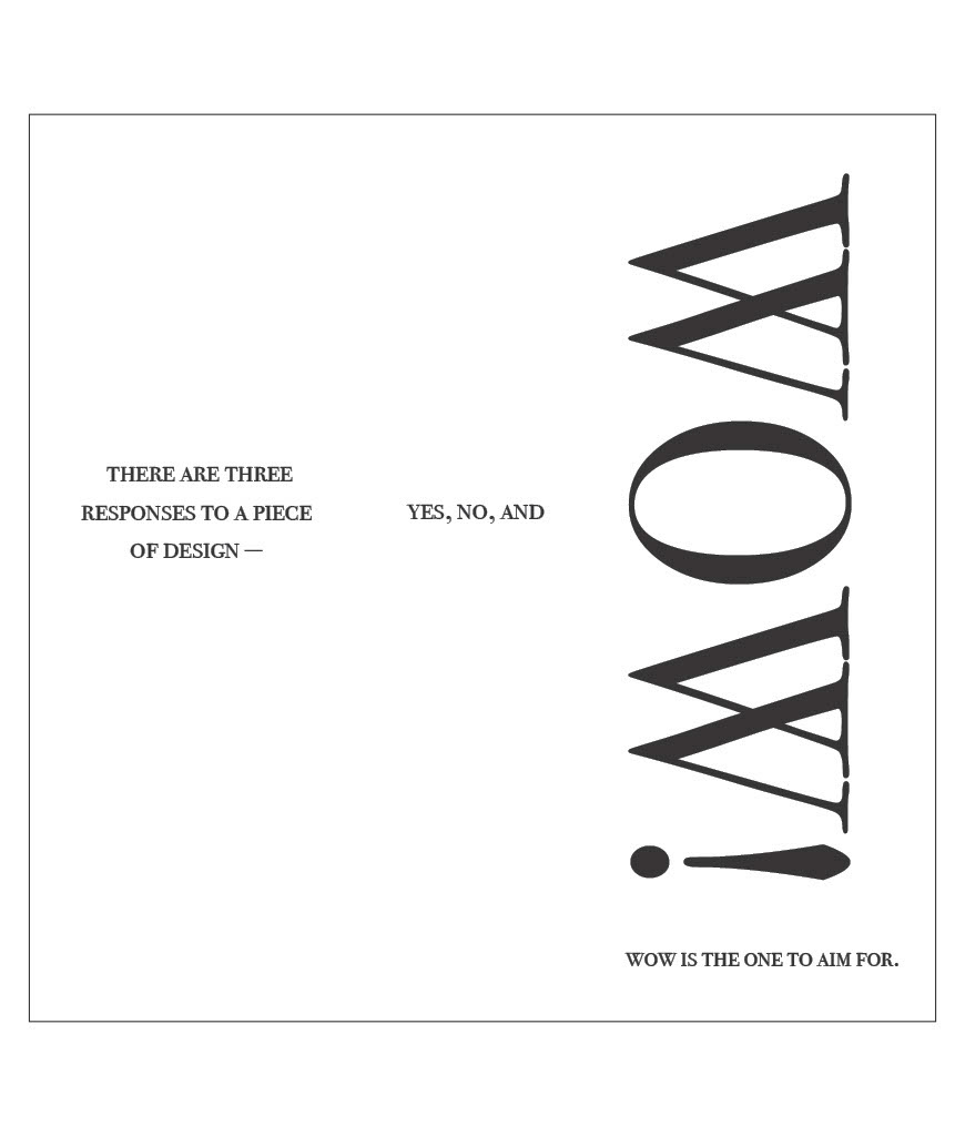
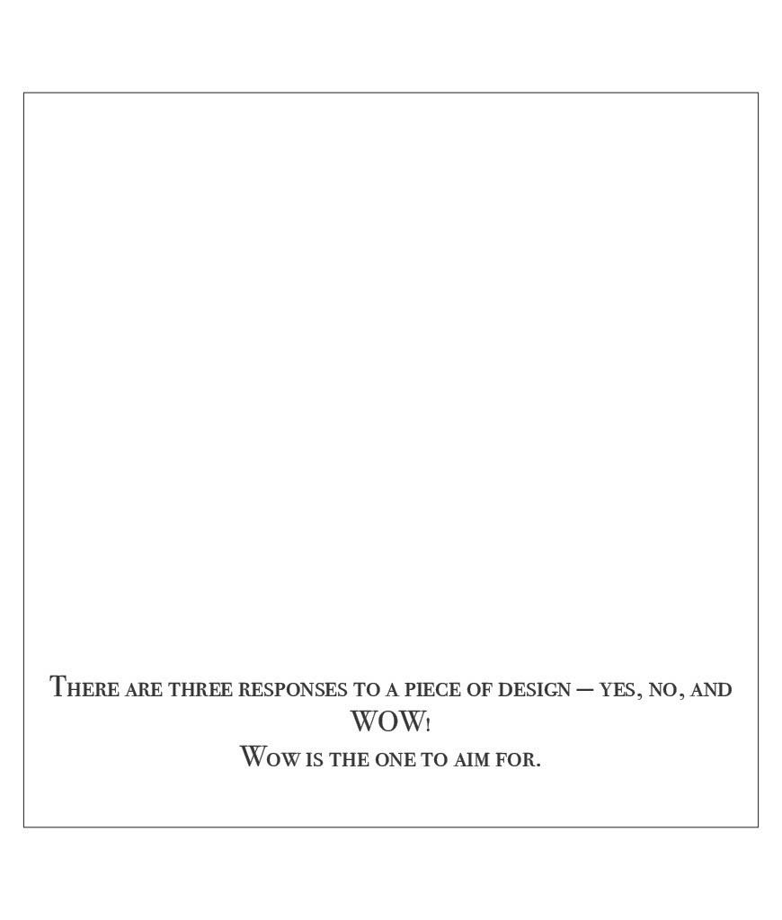
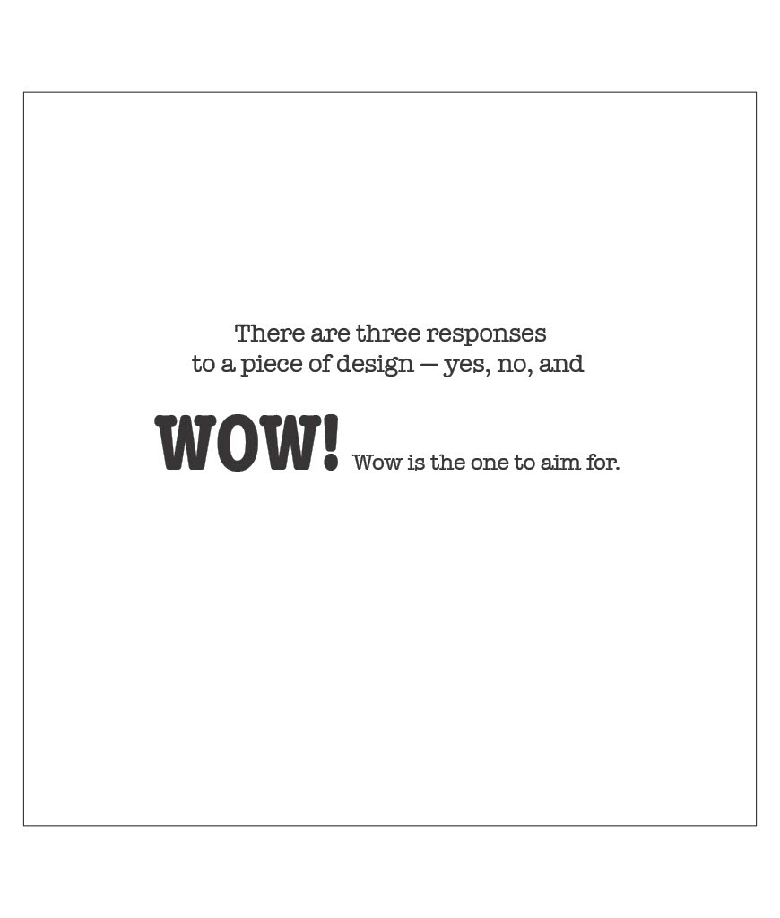
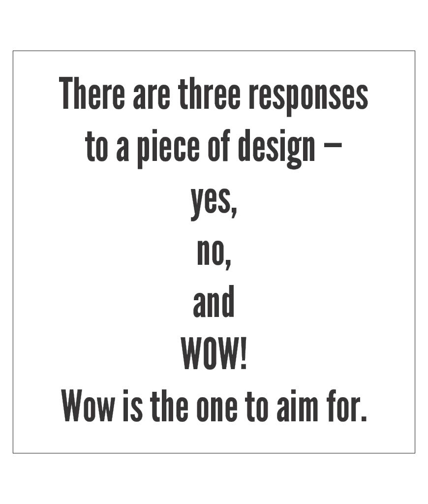
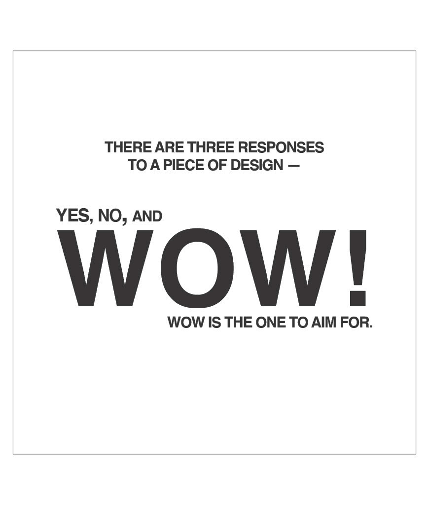
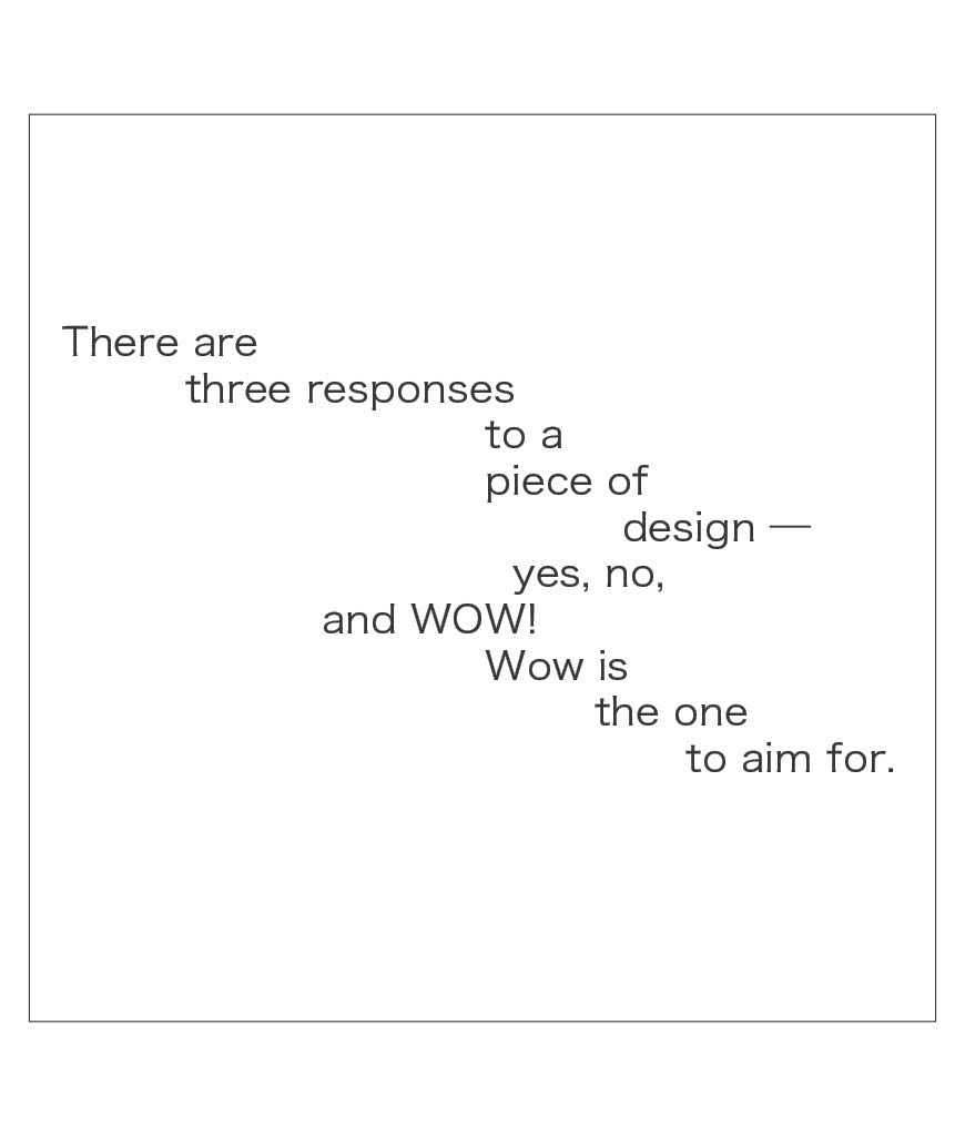
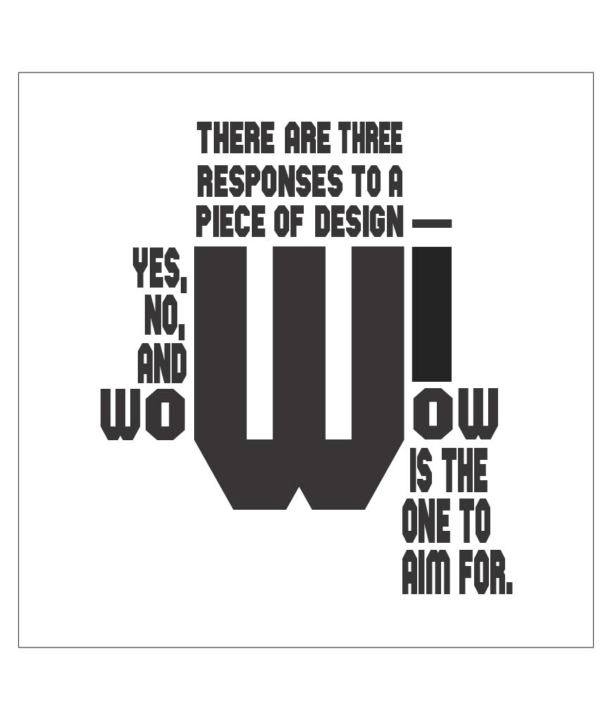
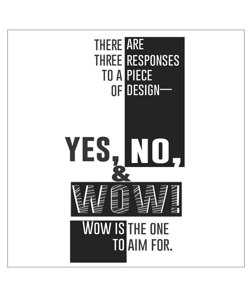
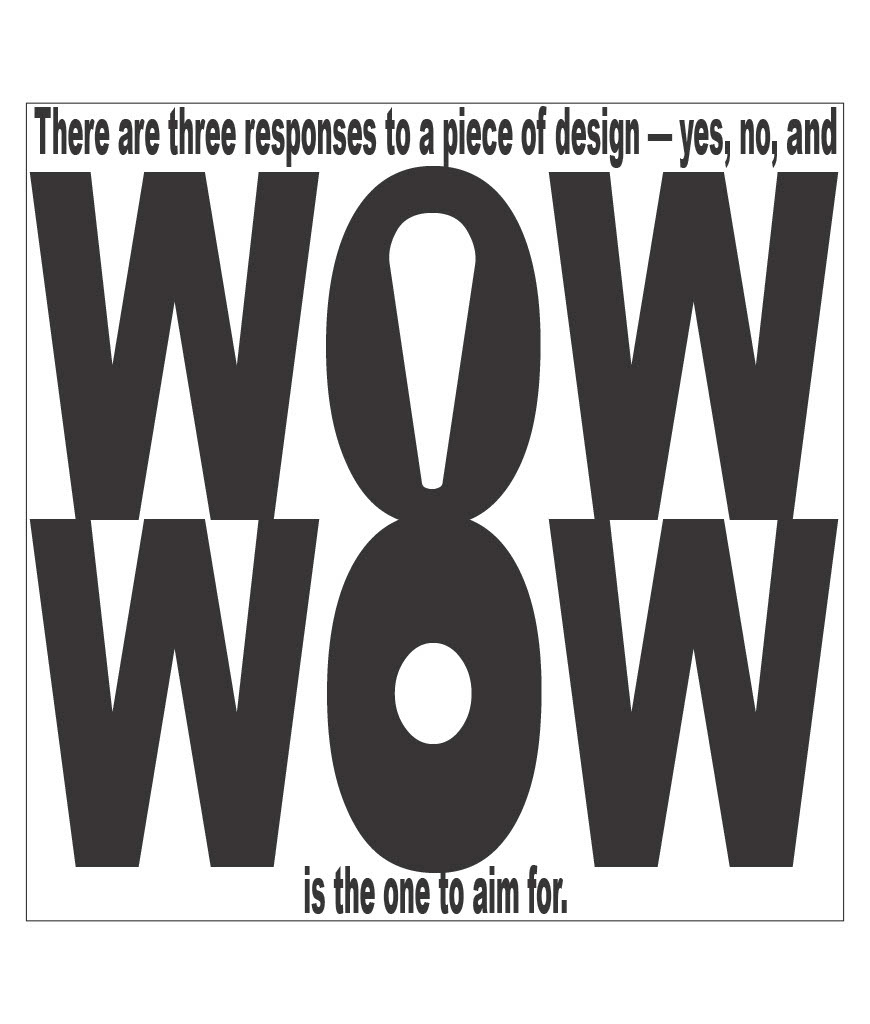
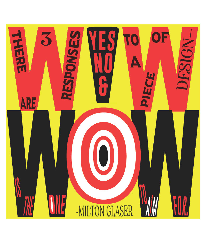
“There are three responses to a piece of design- yes, no, and WOW! Wow is the one to aim for.” This quote is from Milton Glaser, an American graphic designer. He is one of the most celebrated graphic designers in our country. Among his most famous works are the I Love New York Logo, the psychedelic Bob Dylan poster, and the DC Comics Logos. The quote I almost used was "Don’t bunt. Aim out of the ballpark. Aim for the company of immortals."- David Ogilvy. Both quotes have in common this idea of what to aim for when it comes to design, which resonated with me. Another quote I considered was “Digital design is like painting, except the paint never dries.” – Neville Brody. I really liked this quote because it accommodates what I think is a great method for making digital designs, which is to be constantly changing and evolving your piece as new ideas come to mind. Nothing ever has to be final, and I love that about this medium. When thinking about how to divide this quote amongst the space given to me in the project templates, the most obvious choice was to emphasize and isolate “WOW!” Oftentimes, the “yes, no, and” would also be separated from the rest of the quote, though “WOW!” was always meant to be the center of attention. So for this first iteration, I simply tried giving those words their own space/their own lines. The em dash after “design” provided a great spot to break up the quote, which influenced most of my designs across all iterations. In iteration 2 I played around with drastically enhancing the size or boldness of “WOW!”, while keeping “yes, no, and” smaller but still separate from the rest of the quote. With iteration 3 I began allowing the two “wows” to work together, whether they were occupying the same amount of space, forming a shape together, or even sharing letters like on page 9. Throughout peer critiques, the piece from iteration 3 found on page 7 seemed to be the most liked, and I also found it to be one of my favorites. I felt the idea of weaving the exclamation point into the “wows” was pretty clever and wanted to keep that around for my final iteration. I also thought that since I’d spent most of the iterations trying to make the “wows” as big and present as possible, I might as well let them take up the entire page again. But this time, rather than allowing space above and below for the rest of the quote, I placed them inside the letters, something I’d seen others do but hadn’t done myself yet. One of the significant changes I made was in making the “O” in the second “wow” resemble a bullseye, something you aim for. It was nice to bring some visual relevance pertaining to the latter half of the quote in my final design, as with all previous iterations I only ever found myself thinking “How will this fit after the “wows”. Now though, it felt like the entire quote was being included in a more fulfilling way
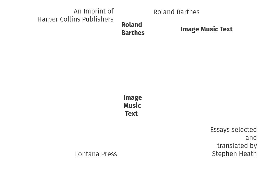
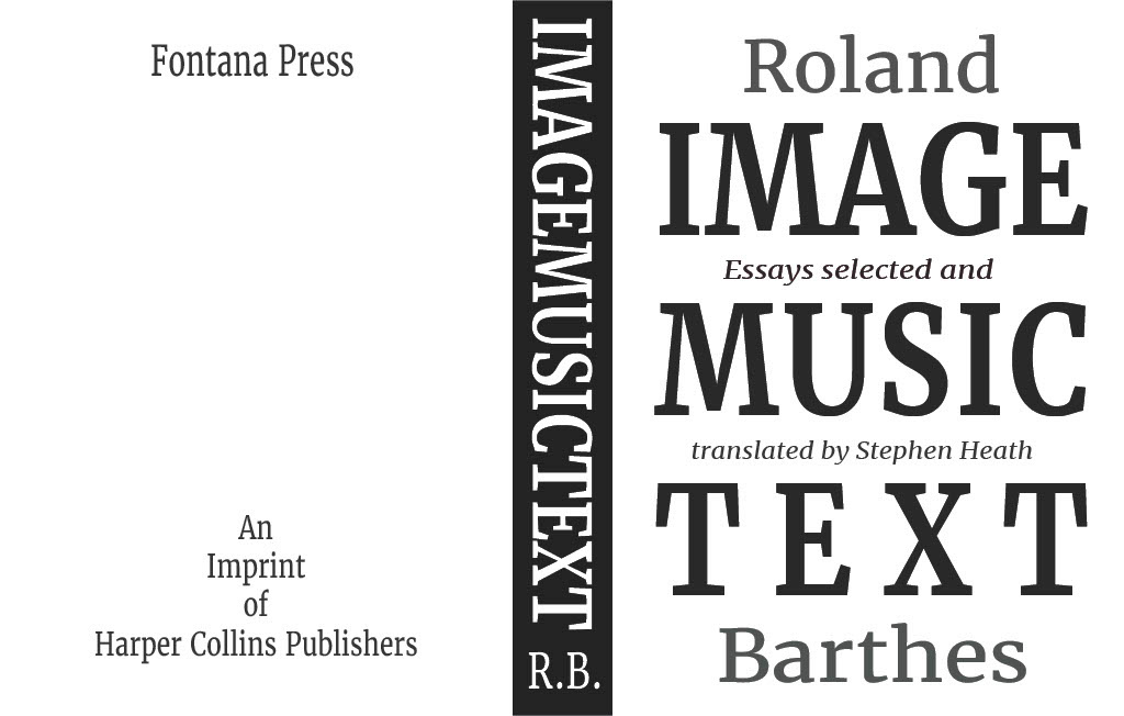
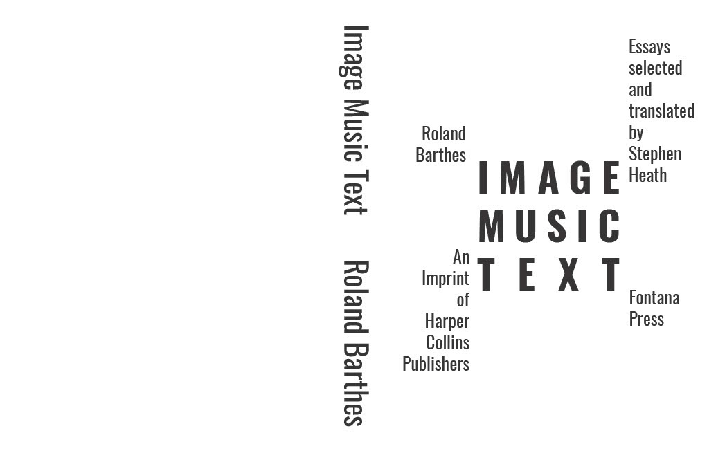
With the first couple of iterations of the book cover, it was honestly a little difficult for me to come up with anything I felt was creative. The first draft of the first iteration really looked like the front page of a screenplay or script, which I actually liked, but I decided not to crowd the cover and let there be a lot of negative space before the "Essays selected by" text. Iteration 2 is the only one to include all pieces of text on the front, which was a result of me trying to switch things up. I think the relationship between the smaller text works well since there are two longer texts and two very short texts that reach across the book title to one another. My first composition for iteration 3 consisted of heavily distorted text for the books title. I liked the way it came out but after showing it to a couple of people outside of the class, it proved a bit too hard to read. It was especially hard without the dividing lines splitting it into quarters. For the final composition I went with something a little more straightforward and took advantage of the space between the title's leading to squeeze some more information onto the front. I played around using different colors (you'll have to take my word for it because I forgot to screenshot it before deleting it) but it ended up being very distracting. I had the title in brown and the author's name in green, which turned into black and white over a grey back- ground, which then turned into the author's name being grey and the rest black.
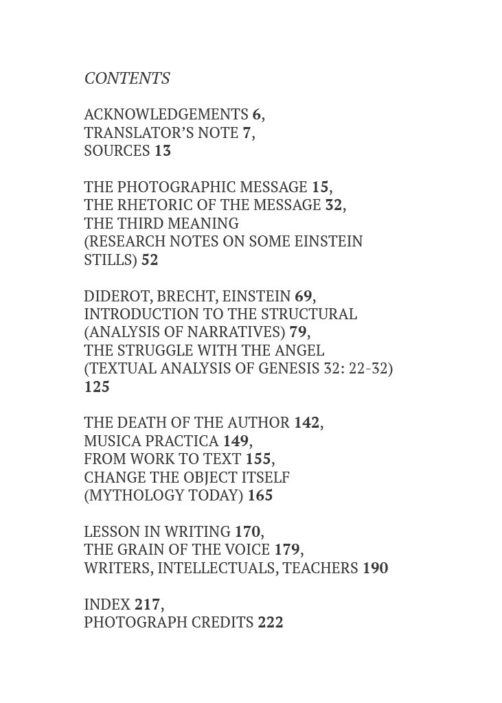
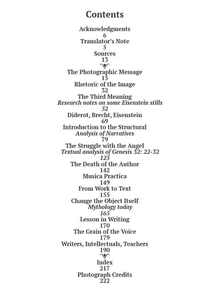
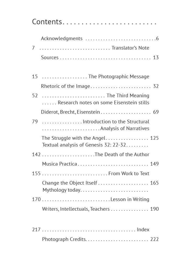
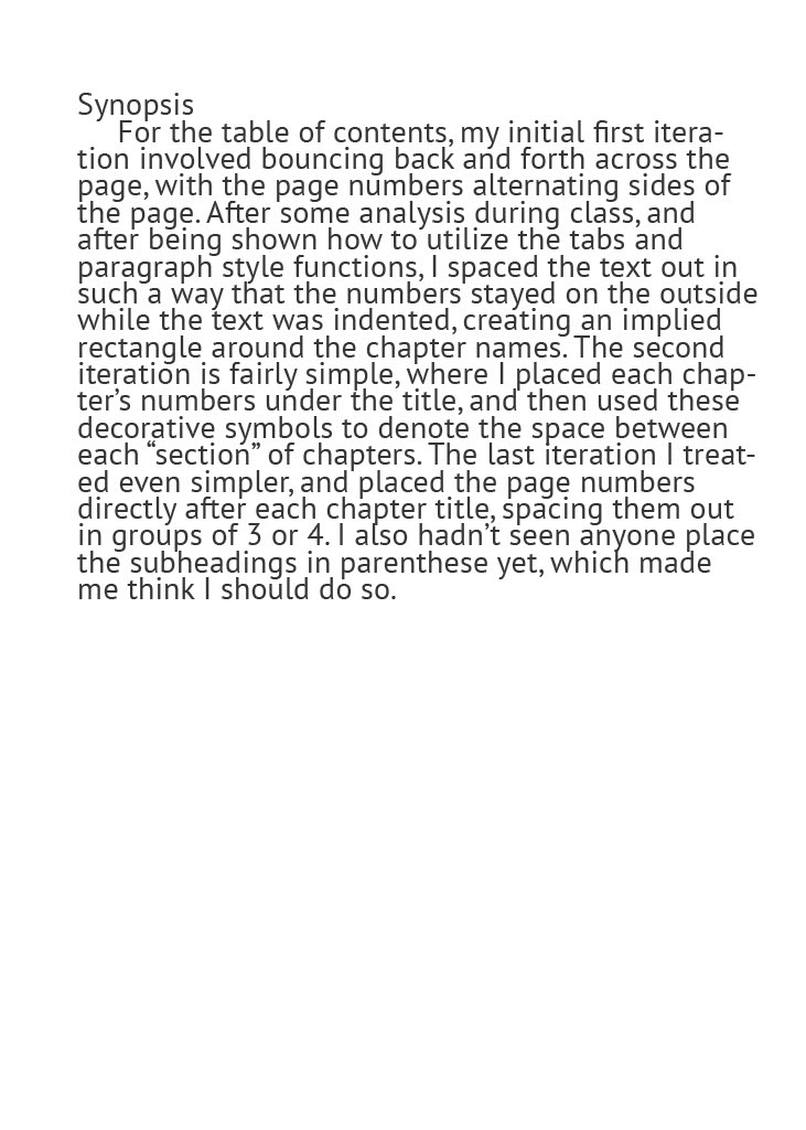
placeholder
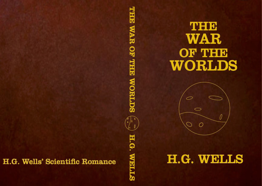
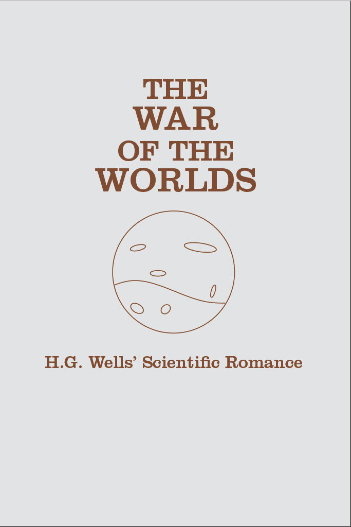

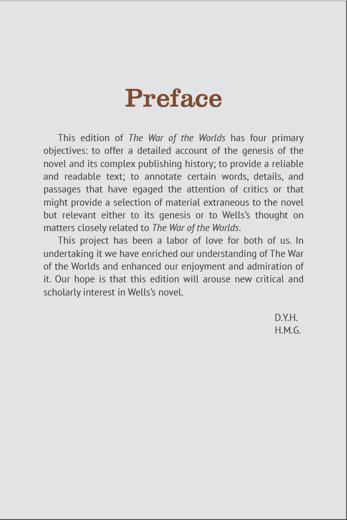
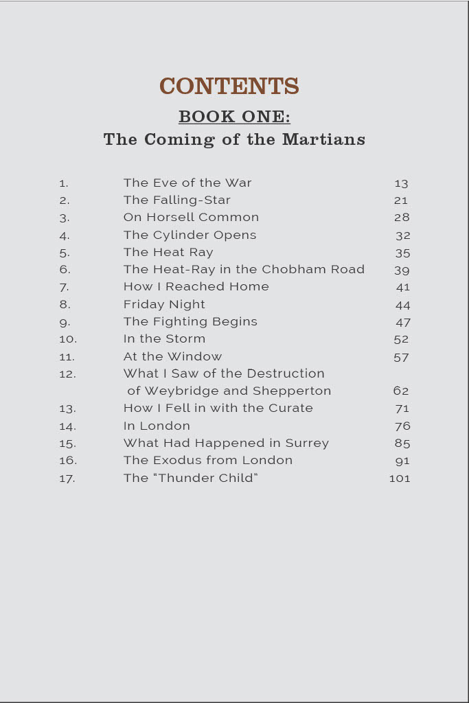
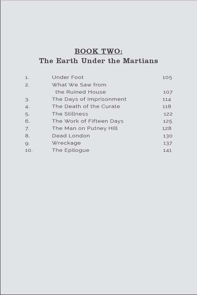
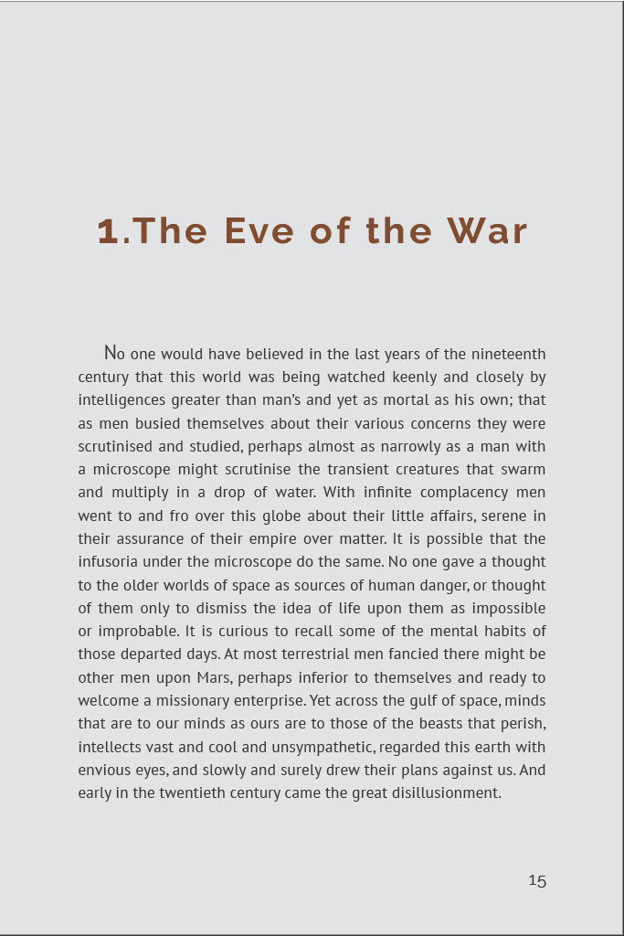
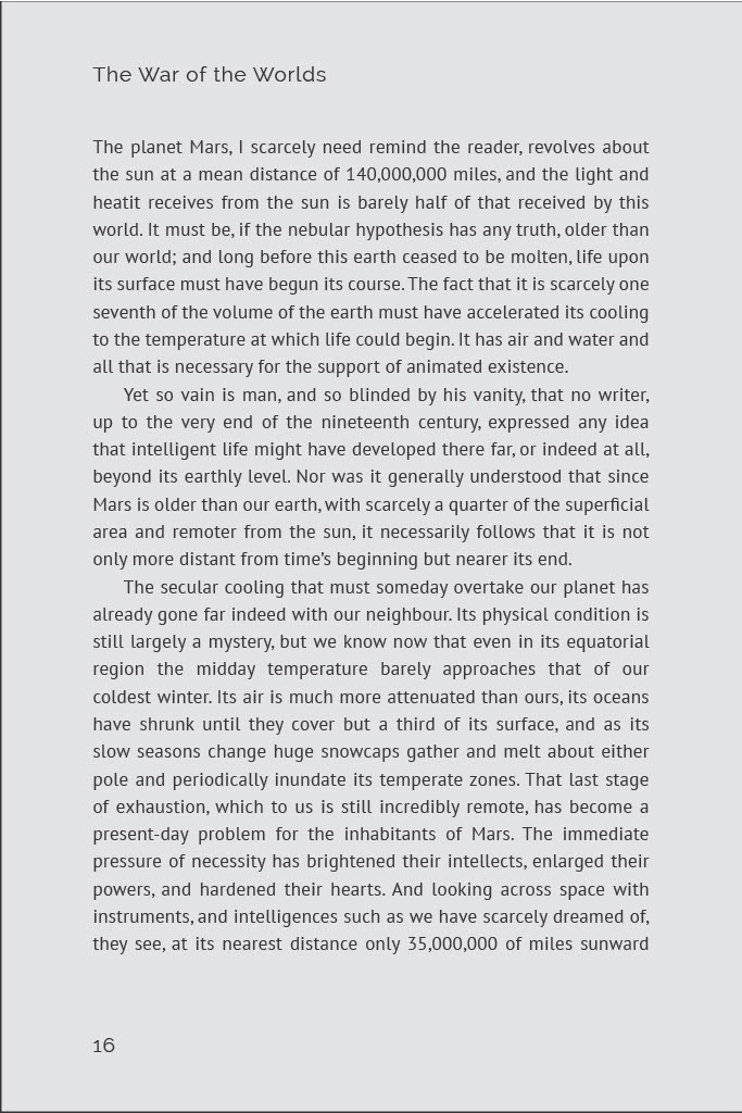
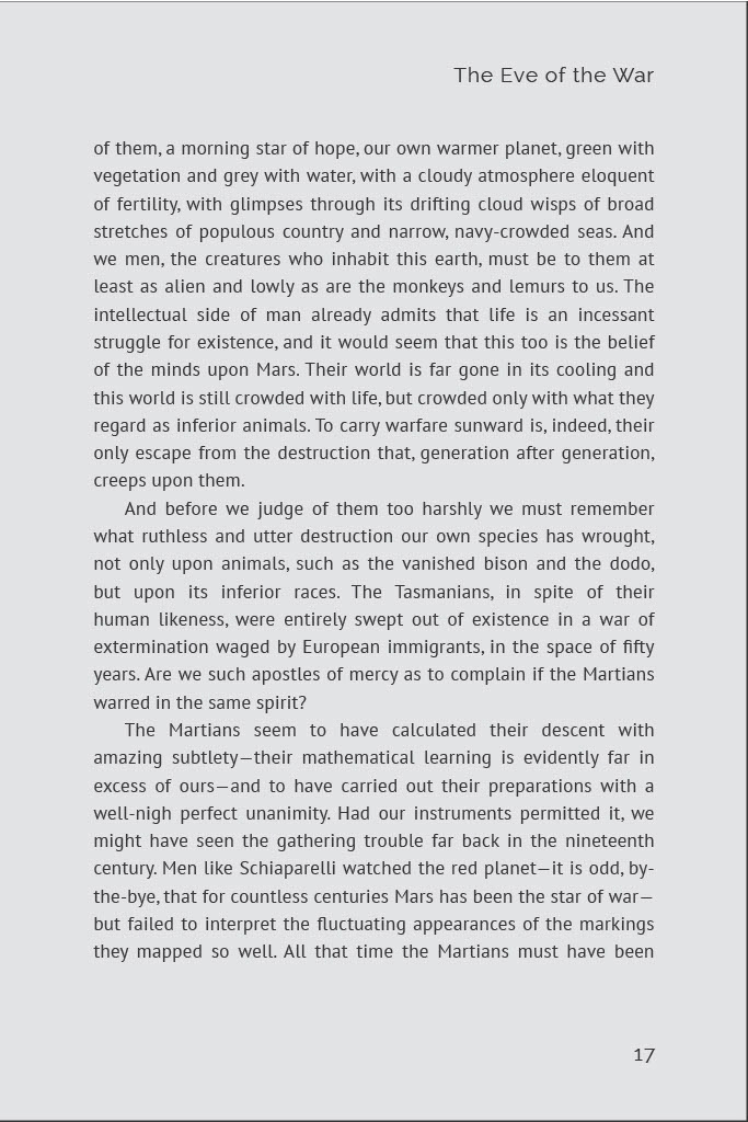
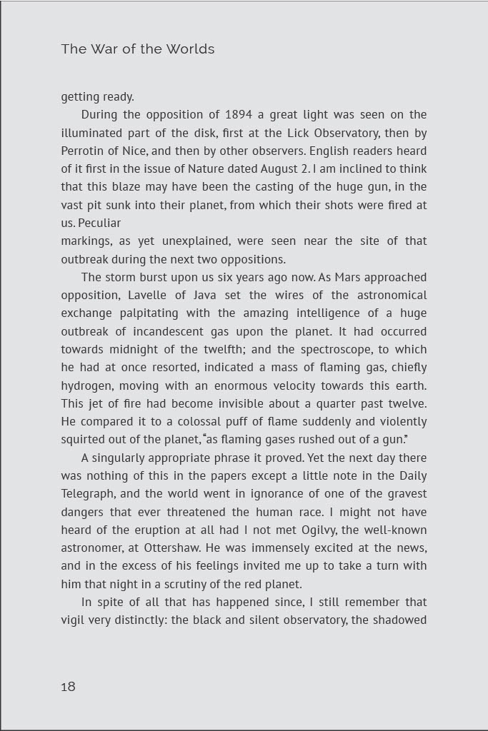
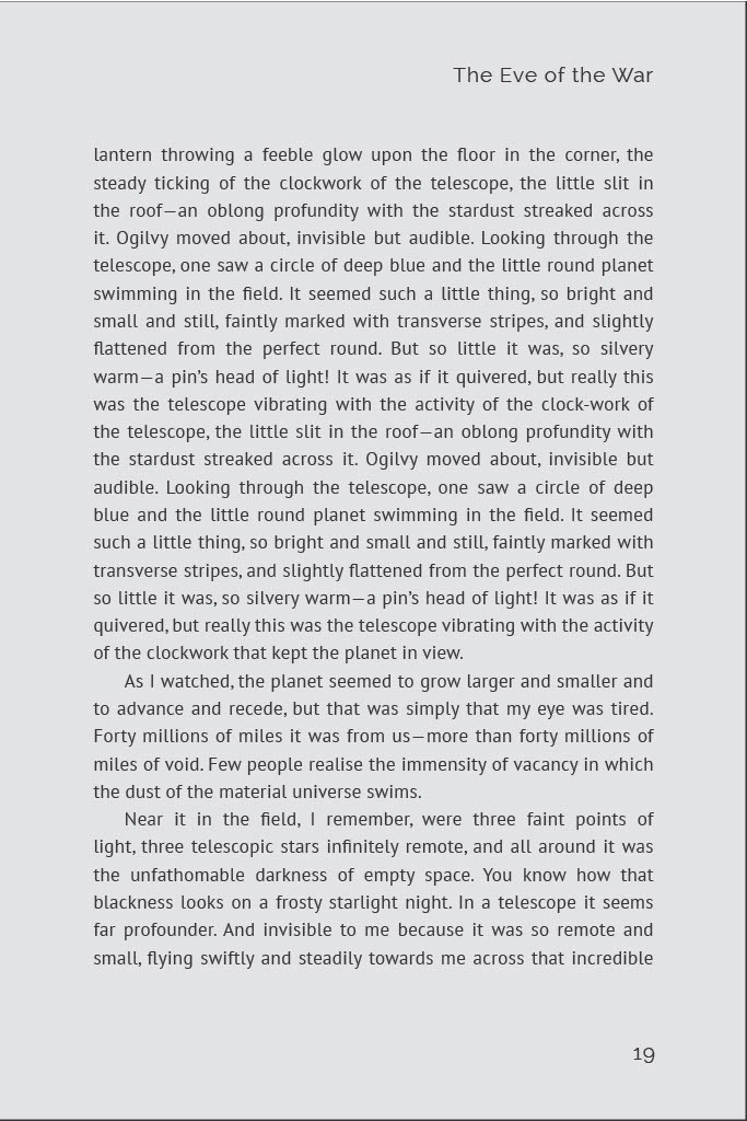
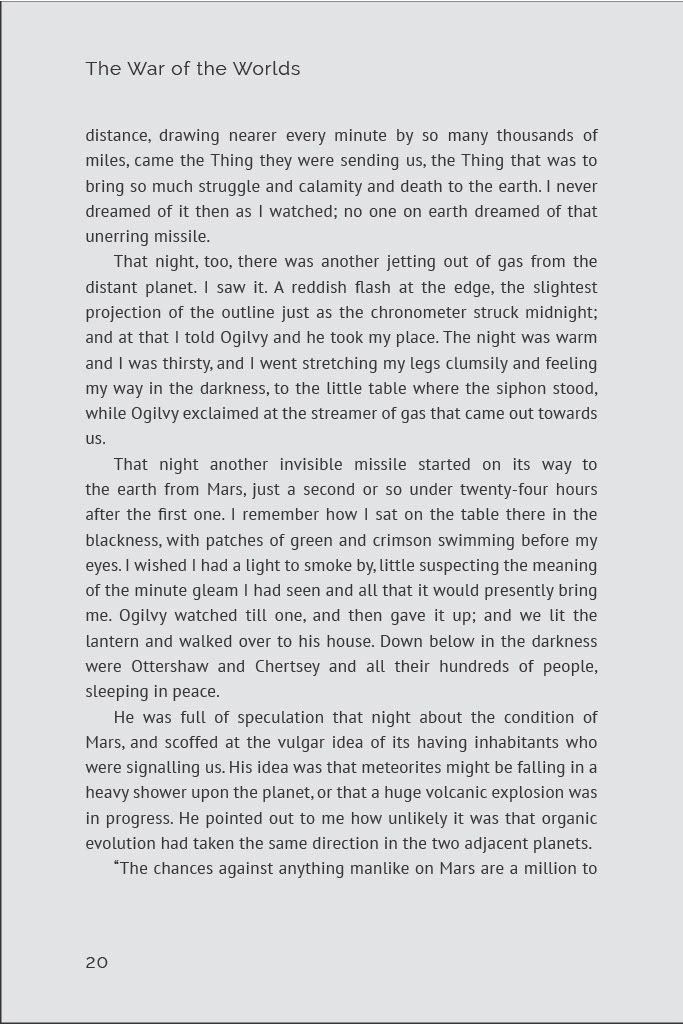
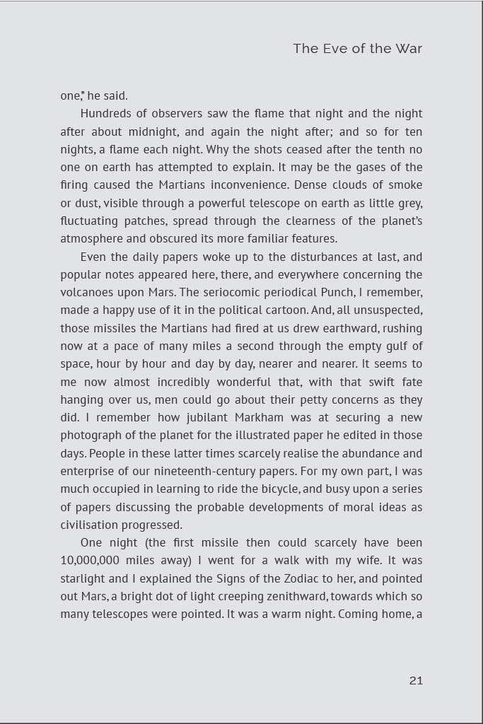
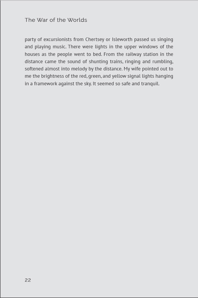
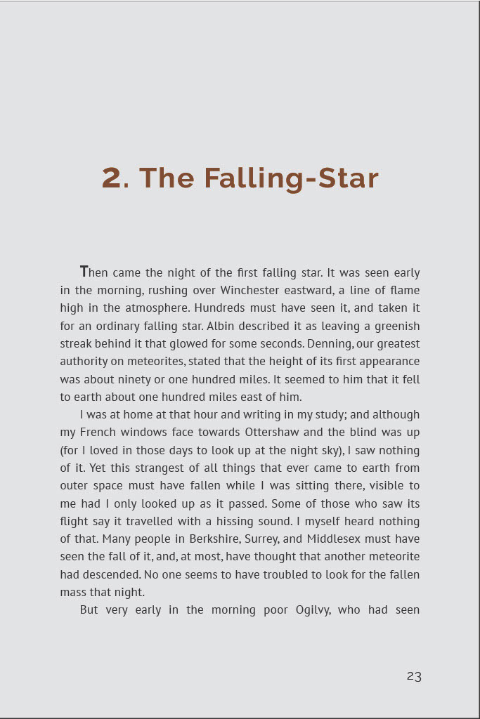
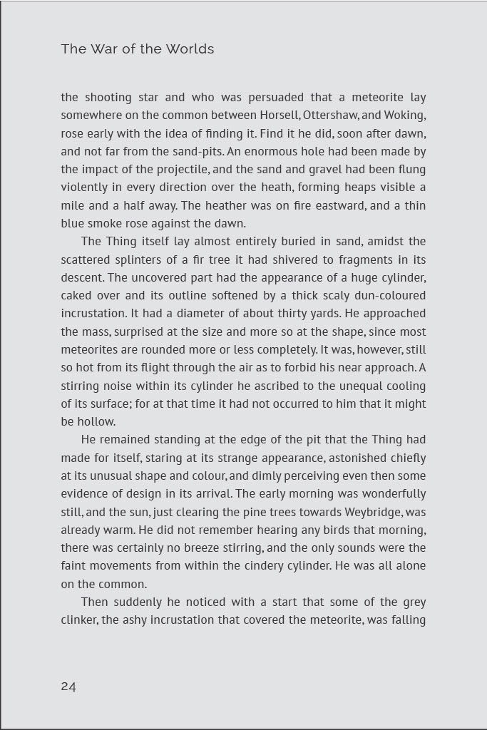
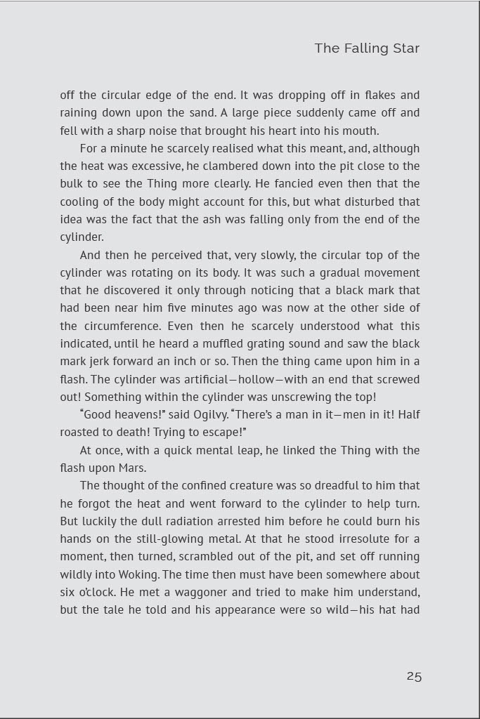
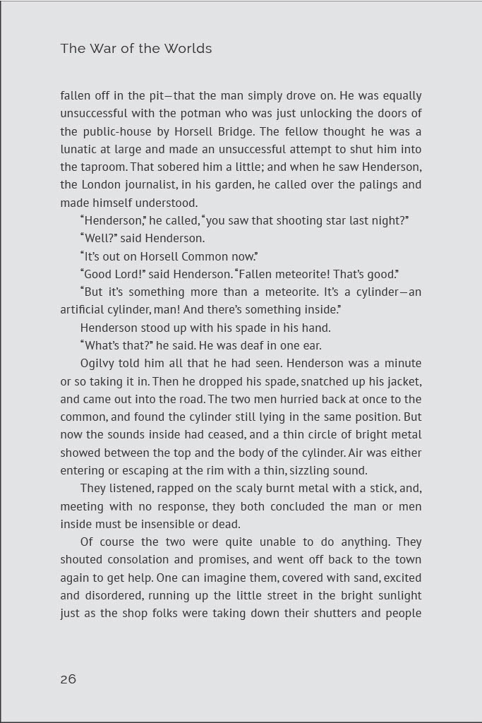
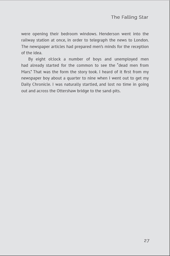
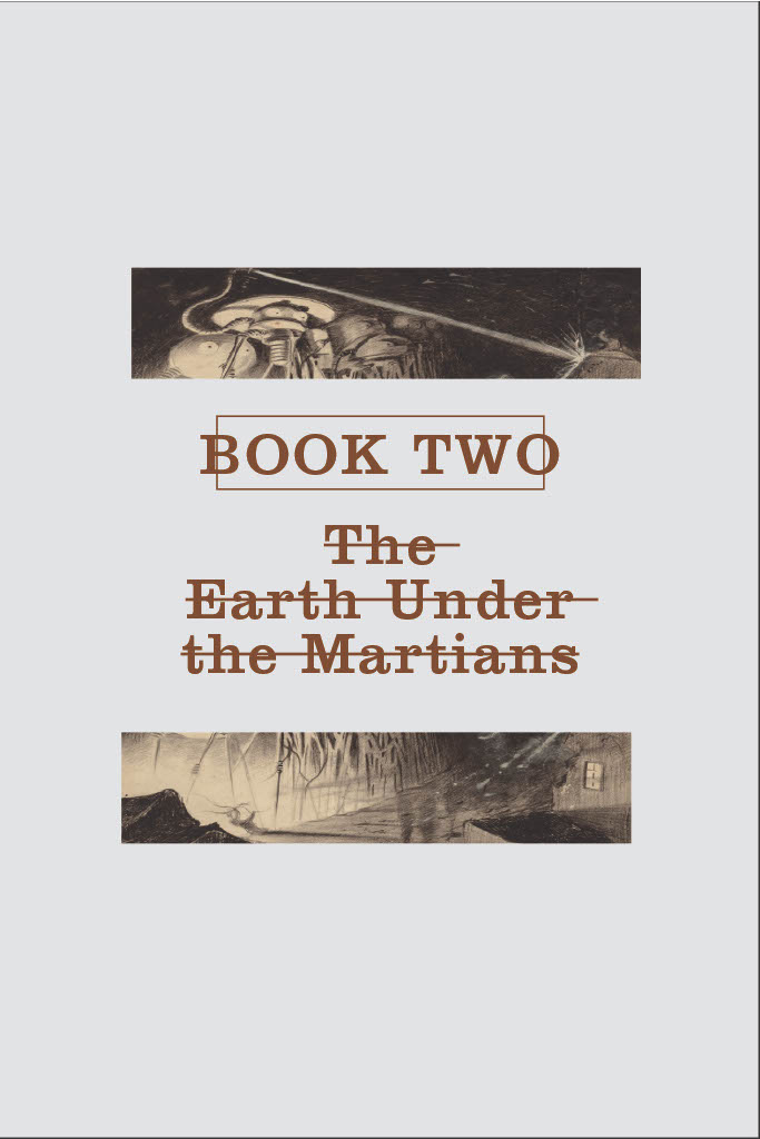
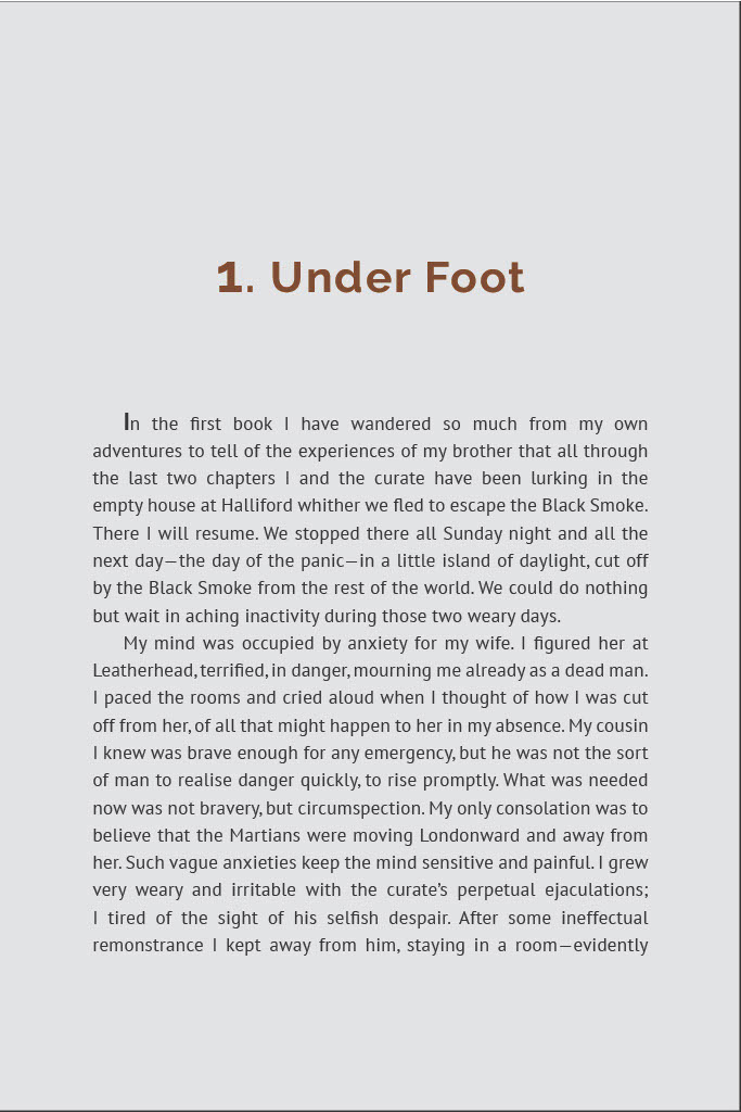
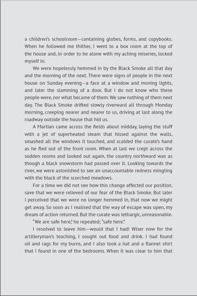
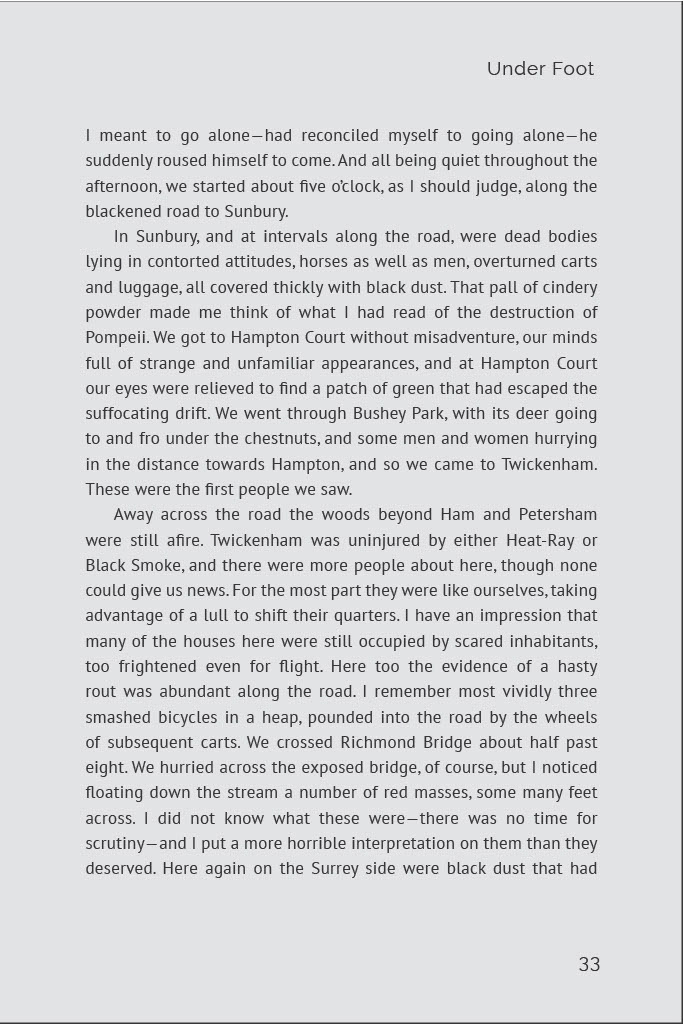
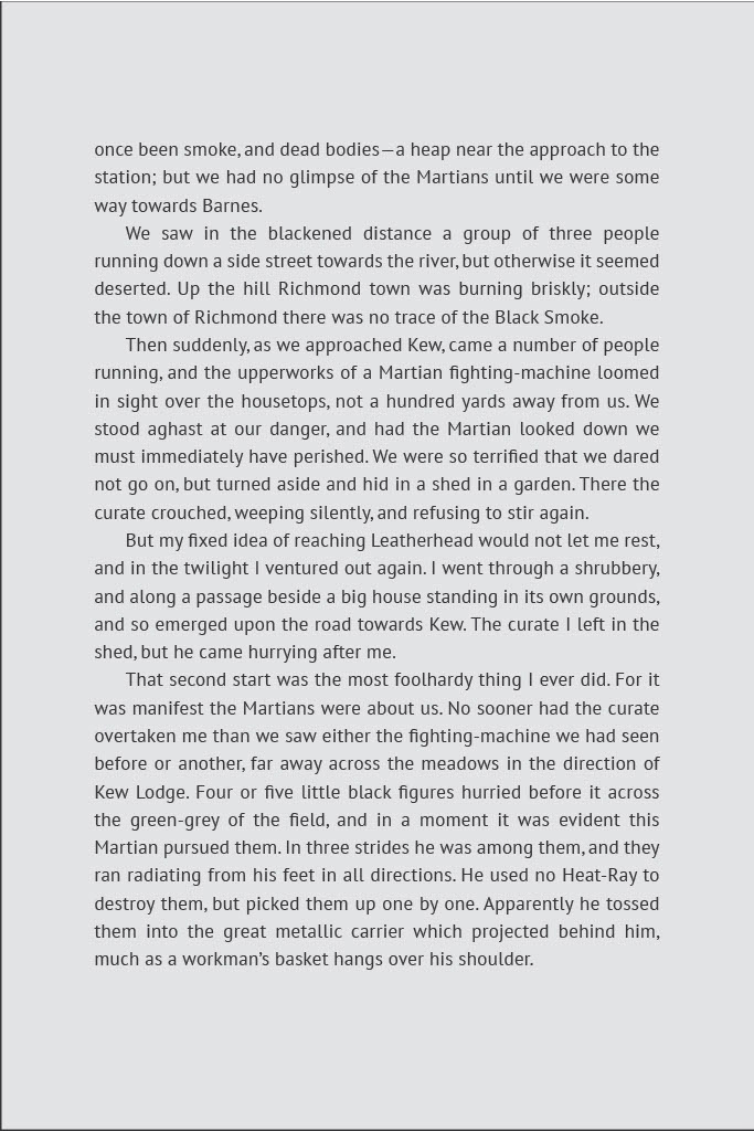
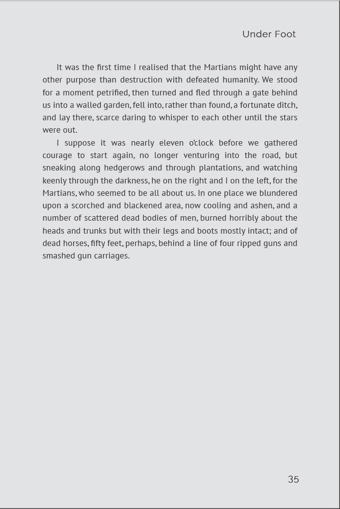
The first part of the project asked us to conduct research into the text that we wished to use. I ended up choosing The War of the Worlds by H.G. Wells. To study the text and to get an idea of what similar texts from the same time period/author were like, I checked out The War of the Worlds, Writers of the Day: H.G. Wells, and H.G. Wells: Complete Short Stories. The particular copy I checked out included no full images or illustrations, and had a blank cover. For my iteration of the book I wanted to add some imagery, but keep it simple and limited. The book Writers of the Day: H.G. Wells was physically very small, with text that seemed large in comparison. I didn’t really like this formatting because it didn’t seem like you could fit enough information on each page. I thought my book should be denser and with more text. I also wanted the text to be simple and easy on the eyes. I originally wanted to use Raleway, as it seemed to fit the sci-fi genre but in a more modern way. I switched to PT Sans as it was a slightly better fit, and kept the Raleway font for the table of contents and chapter titles.
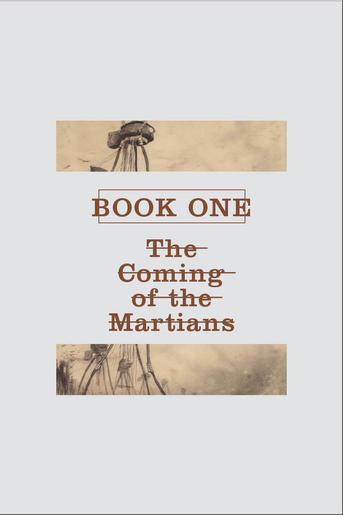
Through my analysis diagram iterations, I confirmed that I wanted a wider body of text. The diagram I based off of Writers of the Day: H.G. Wells was much too skinny. When designing the final book, I wanted to incorporate imagery that worked well with the text, so I used two images that I split up into halves and placed them around the book section introductions. I used brown for larger text such as chapter titles, to match the cover. I tried to approach the cover in a different way and rather than depicting the Martian attackers, simply show a simple image of Mars. For the body text I went with something fairly wide, which was more in line with the analysis diagram of the physical book of The War of the Worlds. I made the page colors a light gray to convey the bleakness of the story.
